• Home
  • About Us
    • Our Mission and Vision
    • The Youth Workin’ It Team
      • Shae Pepper, Managing Director
      • Stephen Pepper, Operations Director
    • Recommendations for the Youth Workin’ It Team
  • Youth Work Resources
    • How To Plan A Youth Retreat Book
    • 52 Scavenger Hunt Ideas
  • Contact Us

Youth Workin' It

Consultancy and Resources for Youth Workers and Organizations Worldwide

  • Youth Group Games
  • Session Plans
  • Fundraisers
  • Youth Retreats
  • Life Skills
  • Interview Skills
  • Scavenger Hunts
  • Would You Rather Questions
  • Program Administration
  • Policies & Procedures
  • Youth Participation
  • Group Agreement

How To Create A Line Graph To Track Youth Attendance

August 22, 2012 By Shae Pepper Leave a Comment

Youth work line graphs
Because we know youth workers love line graphs this much

We’re currently working our way through a series that shows you how to use Excel to track your youth work attendance and how to use bar graphs, pie charts and line graphs to create visuals of that data. These charts and graphs can be very useful in monthly and annual reports and when showing data to prospective donors.

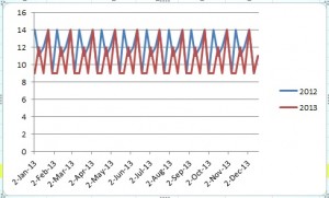
Today we’re going to share with you the steps to creating a line graph which will give a visual of the attendance data from both 2012 and 2013. You will be able to see the two years compared to one another and it will show trends in the data over the course of the year. In the detailed steps below, we’re using our example attendance spreadsheet. Remember the spreadsheet is simply an example – your data will not have such repetitive patterns in it.

1) Open the youth attendance spreadsheet

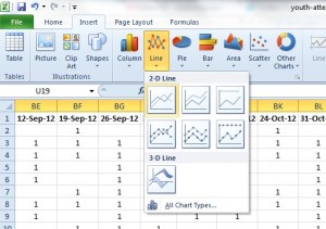
2) Select or highlight the data from Column U Row 19 to Column BT Row 19

3) Click the ‘insert’ tab at the top

4) Choose ‘line’ and click on the first 2D line graph

Youth attendance 1

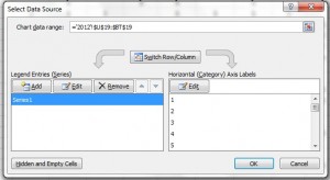
5) Right mouse click on the chart and choose ‘select data’ from the menu that appears

6) Under Legend Entries (Series) Select ‘Series 1’ and click ‘Edit’

Youth attendance 2

7) In ‘Series Name’ type ‘2012’ and click ‘ok’

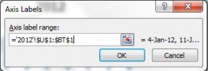
8) In the box that appears now click ‘edit’ under the Horizontal (Category) Axis Labels

9) A data range box has appeared, select Column U Row 1 through Column BT Row 1 and click ‘ok’, then click ‘ok’ again.

Youth attendance 3

Now you have the basics of your line graph (n.b. you may need to scroll along the spreadsheet to see the graph displayed).

To add 2013’s data to the same line graph, follow a similar process:

1) Right mouse click on the chart and choose ‘select data’ from the menu that appears

2) Under Legend Entries (Series) Select ‘2012’ and click ‘Add’

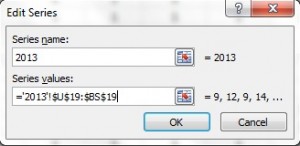
3) In ‘Series Name’ type ‘2013’. In the ‘Series Values’ box, delete the symbols there. Go to the bottom of your spreadsheet and click on the 2013 tab, select the data from Column U Row 19 through Column BS Row 19 and click ‘ok’

Youth attendance 4

4) In the box that appears now click ‘edit’ under the Horizontal (Category) Axis Labels

5) A data range box has appeared; click the 2013 tab and select Column U Row 1 through Column BS Row 1 and click ‘ok’, then ‘ok’ again.

Now you have a line graph that shows the relationship between your attendance in 2012 and 2013.

Youth attendance 5

You might see a trend in youth attendance that peaks or drops at different times of the year. By tracking the data year after year and putting it in this visual format, you’ll be able to see more easily the attendance at your youth work programs.

Question: Are there any aspects of Excel you’d like to know more about to help with your youth work administration? Let us know in the comments below and we’ll try and cover this in the future.

You can also connect with us by:

  1. Signing up to receive our posts via email
  2. Following us on Twitter
  3. Liking us on Facebook
  4. Signing up to our RSS feed


How To Use A Pie Chart For Youth Attendance

August 15, 2012 By Shae Pepper Leave a Comment

Pie chart youth work
Now this is a ‘pi’ joke….

We’re currently working our way through a series about how to use Excel to track youth attendance and to create charts and graphs using that data.

You may be asking yourself, ‘why are they showing me the same information over and over just in different formats?’ Despite Stephen‘s ‘pie’ joke, we’ve actually only shown you how to create a bar graph with your data so far. There are many types of graphs and charts, but the three we’re going to use are the bar graph, the pie chart and the line graph.

  1. Bar Graph – The bar graph is the type of graph you want to use to make a side by side comparison; in our examples, we’ve been showing the change in ages and grades over a two-year period.
  2. Pie Chart – The pie chart is the type of chart you want to use to show the percentage for each part of a ‘whole’; in the end you want your pie to equal 100%.
  3. Line Graph – The line graph is the type of graph you want to use when you need to show a trend over a period of time; we’ll be looking at line graphs in the coming weeks.

Today we’re going to show you how to use the bar chart you already created to create a pie chart. The data will be the same, but you’ll be highlighting the parts of the whole rather than a side-by-side comparison as before.

1) First make sure you’ve created your spreadsheet, or at the very least have our example open.

2) Follow the steps to create a bar graph of youth ages or grades.

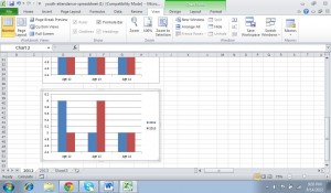
3) Create a copy of your bar chart by copying and pasting it below your original bar chart.

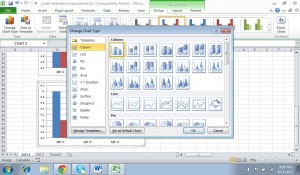
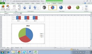
4) In Excel 2010, go to the ‘Chart Tools’ contextual tab (in our example it’s highlighted in green), choose ‘Design’ and then in the far left of the ribbon (toolbar) select ‘Change Chart Type.’

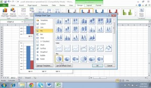
5) From the list in the left of the box that appears, choose ‘Pie’ and select the first pie chart icon.

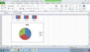
6) At this point your bar chart will become a pie chart.

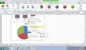
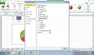
7) Highlight your pie chart by clicking on the pie, then right mouse click and select ‘Add Data Labels’. This will cause the numbers of your data to appear but you want to show percentages.

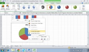
8) Right mouse click over your pie chart again and this time select ‘Format Data Labels.’

9) Uncheck ‘Value’ and click to check ‘Percentage’ and ‘Close.’

You now have a pie chart showing the percentage breakdown for your programs for one year. You can move this on the spreadsheet by dragging it or you can copy and paste it into another document, such as a report in Word or a Powerpoint presentation.

Remember to check back over the next few weeks for the rest of our series where we’ll be creating line graphs to track changes in your youth program attendance over time.

Question: Do you think that using charts and graphs to show your attendance data is useful when writing monthly or annual reports?  Why or why not?  Share your thoughts in the comments below.

You can also connect with us by:

  1. Signing up to receive our posts via email
  2. Following us on Twitter
  3. Liking us on Facebook
  4. Signing up to our RSS feed
 

How To Create Charts Based On Grade Level Attendance

August 8, 2012 By Stephen Pepper Leave a Comment

Tracking youth gradesWe’re currently working on a series about how to use Excel to track youth attendance. Last week we showed you how to track youth ages from one year to the next. This week, we’re going to show how you can use the data to create charts and graphs to track youth grades by attendance from one year to the next.

Over time, you may notice a trend in weeks that certain grades are more likely to attend or years when grade attendance fluctuated. You may want to track this if you’re planning to make changes to your group based on their grades; for example, you might be planning to split your Jr. High from your High School groups.

Alternatively, you may want to track that you have a large number of seniors who are about to graduate and may want to make even more of an effort with new youth recruitment, particularly if you run something like a youth council that counts on new youth each and every year for sustainability.

Remember: the data doesn’t have to be based on youth attendance. If you’re collecting quantitative session evaluations, the results of these could be converted to chart form in order to analyze patterns of how your youth view the sessions you’re running.

Here’s another step-by-step guide to creating charts and graphs using Excel:

1. Download a copy of the youth attendance spreadsheet, as we’ll be using this in the examples below. The spreadsheet has two tabs – one for 2012 and one for 2013. The chart we’ll be producing will be based on the grades of the young people at the program, so we’ll be using columns R-T.

2. With your spreadsheet open, click on “Insert” and select the type of chart or graph that you want to produce. For this example, we’ll be creating a “Column” chart, which will be a “2D column”.

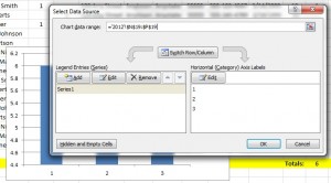
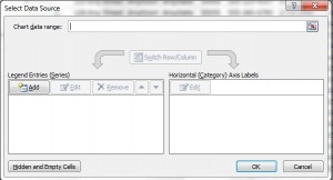
3. This will display a blank rectangle on the spreadsheet. Right-click on the rectangle and choose “Select Data”. This will bring up the box displayed below.

Youth grade - 1

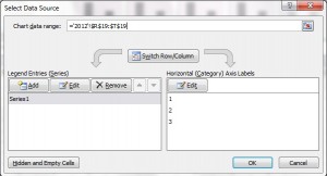
4. Click in the box where it says “Chart data range”. As mentioned above, we’re going to track the grades of youth in your program, so highlight the totals for each grade – in this case, cells R19, S19 & T19. To highlight the cells, click and drag so that these three cells are highlighted. This will autofill the chart data range to say =’2012′!$R$19:$T$19

Youth grade 2

5. Next, beneath where it says “Legend Entries (Series)”, click “Edit”. As this series will be displaying grades of youth in 2012, we’ll name the series “2012″ and click OK.

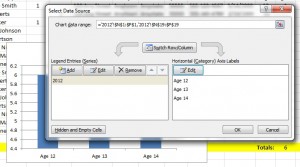
6. This will display the columns as 1, 2 & 3 rather than the relevant grades. To ensure the grades are listed in the chart, click on “Edit” beneath where it says “Horizontal (Category) Axis Labels”. The grades are shown in cells R1, S1 & T1, so highlight these cells in the same way that you highlighted the total of the grades in step 4, then click OK. This will now display the grades on the chart (see image below).

Youth grade 3

7. We want to compare the grades of youth in your programs in 2012 against the grades in 2013. We therefore need to add an additional entry for 2013. To do this, click “Add” beneath ”Legend Entries (Series)” and click on the tab at the bottom of the page for “2013″. Rename the series as “2013″. In the box for “Series Values”, delete the value that’s pre-populated (in our example it says ={1}). Replace it with the 2013 grade total data, by again highlighting cells R19, S19 & T19, then click OK.

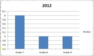
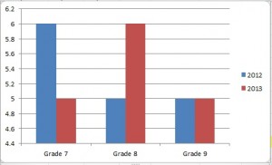
8. Click OK on the main box and it’ll display your chart. You can move this on the spreadsheet by dragging it, or you can copy and paste it into another document, such as a report in Word or a Powerpoint presentation.

Youth grade 4

Question: Do you produce charts and graphs for your youth programs? If so, what data do you collate? Let us know in the comments below.

You can also connect with us by:

  1. Signing up to receive our posts via email
  2. Following us on Twitter
  3. Liking us on Facebook
  4. Signing up to our RSS feed
 

How To Create Charts And Graphs Of Youth Attendance

August 1, 2012 By Stephen Pepper Leave a Comment

Youth attendance
Mmmmm……..pie……..the best type of chart

Last week we showed you how you can use Excel to track youth attendance. This week, we’re going to show how you can use that data to create charts and graphs of youth attendance.

This can be especially useful when producing end-of-year / end of youth program reports, as the charts and graphs can be easily inserted into the reports. This displays the data in a more interesting fashion and can help the reader identify patterns of attendance.

The data doesn’t have to be based on youth attendance though. If you’re collecting quantitative session evaluations, the results of these could be converted to chart form in order to analyze patterns of how young people view your sessions.

Here’s a step-by-step guide to creating charts and graphs using Excel:

1. Download a copy of the youth attendance spreadsheet, as we’ll be using this in the examples below. There are two tabs on the spreadsheet – one for 2012 and one for 2013. The chart we’ll be producing will be based on the age of the young people at the program, using columns N-P.

2. With your spreadsheet open, click on “Insert” and then select the type of chart or graph that you want to produce. In this instance we’ll be creating a “Column” chart, which will be a “2D column”.

3. This will display a blank rectangle on the spreadsheet. Right-click on the rectangle and choose “Select Data”. This will bring up the box displayed below.

Youth attendance - 1

4. Click in the box where it says “Chart data range”. As mentioned above, we’re going to be tracking the ages of youth in the program, so we’ll highlight the totals for each age – in this case, cells N19, O19 & P19. To highlight these cells, just click and drag so that these three cells are highlighted. This will autofill the chart data range to say =’2012′!$N$19:$P$19

Youth attendance - 2

5. Next, beneath where it says “Legend Entries (Series)”, click “Edit”. As this series will be displaying ages for youth in 2012, we’ll give the series name as “2012” and click OK.

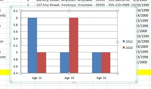
6. This currently displays the columns as 1, 2 & 3 rather than the relevant ages. To include this data, click on “Edit” beneath where it says “Horizontal (Category) Axis Labels”. As the ages are displayed in cells N1, O1 & P1, highlight these cells in the same way that you’d highlight the total of the ages in step 4, then click OK. You should now be able to see the ages displayed on the chart (see image below).

Youth attendance - 3

7. We want to compare the ages of youth in your programs in 2012 against the ages in 2013. We therefore need to add an entry for 2013. To do this, click “Add” beneath “Legend Entries (Series)” and then click on the tab at the bottom of the page for “2013”. Rename the series name as “2013”. In the box for “Series Values”, delete the value that’s in there (which in our example says ={1}). Replace it with the 2013 age total data, by again highlighting cells N19, O19 & P19, then click OK.

8. Click OK on the main box and you’ll see your chart. This can be moved on the spreadsheet by dragging it, or can be copied and pasted into another document (like a report in Word or a Powerpoint presentation).

Youth attendance - 4

Question: Do you produce charts and graphs for your youth programs? If so, what data do you collate? Let us know in the comments below.

You can also connect with us by:

  1. Signing up to receive our posts via email
  2. Following us on Twitter
  3. Liking us on Facebook
  4. Signing up to our RSS feed
 

How To Use Excel To Track Youth Attendance

July 25, 2012 By Shae Pepper Leave a Comment

youth program attendance
Wave your hands in the air like you just don’t care……or are just taking attendance

Woohoo! Excel Spreadsheets!

I can feel your enthusiasm oozing from my screen even now as you read these words. I know, it’s hard to let go of your friend, the Word Document Table, but I promise you, there is room in your life for Excel. It may not be your friend now, but after a few more tips and tricks from us, you’ll wonder how you ever thought you could live without it in your life.

Keeping track of your youth attendance can be challenging. You may have tried sign-in sheets, registration or just actual counting. With smaller youth groups and programs you can use the youth’s name, maybe by having a registration, sign in sheet or by taking attendance. Then you can put it directly into an Excel spreadsheet and track attendance of a youth or all your youth over time.

You can also track numbers for larger youth groups. Do the count as normal and then input it into a basic Excel Spreadsheet. Just like your smaller youth group and program counterparts, you’ll be able to generate charts and graphs that map out your attendance.

You can also monitor attendance over many years in this way. By keeping track of the attendance of young people at your spring and fall youth retreats or summer youth camps, you can watch the attendance grow or dwindle. You can even keep track of attendance by session topics, which may over time help you know which sessions youth are finding more engaging.

Here we go, step-by-step, on how to create a basic Excel Spreadsheet for tracking youth attendance.

To keep track of these steps, download the sample template for youth program attendance.

1. Open a new Excel spreadsheet

2. In the first row, fill in the important information you need to capture. In our example it’s:

  • First name
  • Last name
  • Parent’s name(s)
  • Gender
  • Address
  • Phone number
  • Date of birth
  • Age
  • Grade

Then include the dates that you need for your program. In our example, I’ve included every day from September 1, 2012 through September 30, 2012. However, you can also list dates by week if you only meet weekly with your groups (like on Sundays, Wednesdays or Tuesdays). Finally, put a total column at the end.

3. Fill in the information about your youth. In our example, it’s Jane Smith and John Roberts and put a 1 for each date that they attended sessions. If they didn’t attend just put a 0 or leave it blank.

4. Using ‘Auto Sum’, you can tally the total number of times Jane and John attended your program during the month of September. By adding a ‘total’ row at the bottom of the list of youth, you can also track how many youth attended on each day you had sessions. This can be helpful because you may find that you should move your sessions from a Tuesday to a Thursday based on attendance tracking.

5. You can also track age and grades of the youth in your programs by using the same techniques. You include all the possible ages and grades of the youth in your programs and put a 1 under each age or grade for each youth.

6. You can use colors to help you identify different weeks, total columns and rows or grades, ages or gender.

7. You can sort data using the ‘sort’ tool and group all your youth by age, gender, grade or alphabetical order.

8. Spreadsheets can be grouped by year, month or program. You can use the tabs at the bottom to identify which year, month or program it is within the spreadsheet. For example, you could have a spreadsheet for 2012 and each tab could be by month or by program name. Alternatively, you could have a spreadsheet that’s by group and each tab is a month or year. It all comes down to preference and ease of use for you.

Now that you’ve gathered all this information, you can start producing charts and graphs of youth attendance based on age or based on grade level.

Questions: Do you track data on your youth; if so, what kinds and how? Is this spreadsheet helpful? Please ask any questions or share your thoughts in the comments below.

You can also connect with us by:

  1. Signing up to receive our posts via email
  2. Following us on Twitter
  3. Liking us on Facebook
  4. Signing up to our RSS feed
 

« Previous Page
Next Page »

501 Would You Rather Questions

501 Would You Rather Questions

52 Scavenger Hunt Ideas

52 Scavenger Hunt Ideas cover

How To Plan A Youth Retreat

How To Plan A Youth Retreat cover

Categories

Best Of Youth Workin' It
Book Reviews
Guest Post
Spotlight on Youth
Types Of Youth Work
Would You Rather Questions
Youth & Society
Youth Group Activities
Youth Group Fundraiser
Youth Group Games
Youth Retreat
Youth Work Program Administration
Youth Work Q & A
Youth Work Session Plan Ideas
Youth Worker Stuff
Youth Workin' It Stuff

Tags

Administration Balloons Boundaries Budget Christmas Communication Facebook Food Food Games Global Issues Global Youth Work Goal Setting Group Development Group Games Guest Posts Interview Skills Life Skills Parents Planning Policies and Procedures Relationships Relay Games For Teenagers Scavenger Hunt Ideas School Self-Esteem SMART Social Media Strategic Planning Team Building Twitter Up Front Games Volunteering Volunteers Water Games For Youth Would You Rather Youth Behavior Youth Cartel Youth Group Bonding Youth Participation Youth Retreat Center Youth Retreat Themes Youth Scavenger Hunt Youth Work Definition Youth Work Resources Youth Work Training

Search Youth Workin’ It

All Content © Copyright 2011-2025, Stephen & Shae Pepper, youthworkinit.com