![]() We’re currently working on a series about how to use Excel to track youth attendance. Last week we showed you how to track youth ages from one year to the next. This week, we’re going to show how you can use the data to create charts and graphs to track youth grades by attendance from one year to the next.
We’re currently working on a series about how to use Excel to track youth attendance. Last week we showed you how to track youth ages from one year to the next. This week, we’re going to show how you can use the data to create charts and graphs to track youth grades by attendance from one year to the next.
Over time, you may notice a trend in weeks that certain grades are more likely to attend or years when grade attendance fluctuated. You may want to track this if you’re planning to make changes to your group based on their grades; for example, you might be planning to split your Jr. High from your High School groups.
Alternatively, you may want to track that you have a large number of seniors who are about to graduate and may want to make even more of an effort with new youth recruitment, particularly if you run something like a youth council that counts on new youth each and every year for sustainability.
Remember: the data doesn’t have to be based on youth attendance. If you’re collecting quantitative session evaluations, the results of these could be converted to chart form in order to analyze patterns of how your youth view the sessions you’re running.
Here’s another step-by-step guide to creating charts and graphs using Excel:
1. Download a copy of the youth attendance spreadsheet, as we’ll be using this in the examples below. The spreadsheet has two tabs – one for 2012 and one for 2013. The chart we’ll be producing will be based on the grades of the young people at the program, so we’ll be using columns R-T.
2. With your spreadsheet open, click on “Insert” and select the type of chart or graph that you want to produce. For this example, we’ll be creating a “Column” chart, which will be a “2D column”.
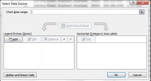
3. This will display a blank rectangle on the spreadsheet. Right-click on the rectangle and choose “Select Data”. This will bring up the box displayed below.
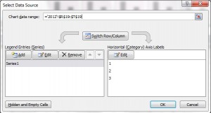
4. Click in the box where it says “Chart data range”. As mentioned above, we’re going to track the grades of youth in your program, so highlight the totals for each grade – in this case, cells R19, S19 & T19. To highlight the cells, click and drag so that these three cells are highlighted. This will autofill the chart data range to say =’2012′!$R$19:$T$19
5. Next, beneath where it says “Legend Entries (Series)”, click “Edit”. As this series will be displaying grades of youth in 2012, we’ll name the series “2012″ and click OK.
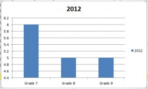
6. This will display the columns as 1, 2 & 3 rather than the relevant grades. To ensure the grades are listed in the chart, click on “Edit” beneath where it says “Horizontal (Category) Axis Labels”. The grades are shown in cells R1, S1 & T1, so highlight these cells in the same way that you highlighted the total of the grades in step 4, then click OK. This will now display the grades on the chart (see image below).
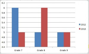
7. We want to compare the grades of youth in your programs in 2012 against the grades in 2013. We therefore need to add an additional entry for 2013. To do this, click “Add” beneath ”Legend Entries (Series)” and click on the tab at the bottom of the page for “2013″. Rename the series as “2013″. In the box for “Series Values”, delete the value that’s pre-populated (in our example it says ={1}). Replace it with the 2013 grade total data, by again highlighting cells R19, S19 & T19, then click OK.
8. Click OK on the main box and it’ll display your chart. You can move this on the spreadsheet by dragging it, or you can copy and paste it into another document, such as a report in Word or a Powerpoint presentation.
Question: Do you produce charts and graphs for your youth programs? If so, what data do you collate? Let us know in the comments below.
You can also connect with us by:
- Signing up to receive our posts via email
- Following us on Twitter
- Liking us on Facebook
- Signing up to our RSS feed


