 Over the past few weeks we’ve been showing you the many ways in which you can use Excel – and subsequently the charts and graphs feature in Excel – to track youth attendance. It’s valuable for many reasons, but two main ones are for proving outcomes in monthly and annual reports and to provide quantitative data for potential or current funders and donors.
Our final charts and graphs today will show individual youth attendance. This is particularly useful if you have an ongoing program like a faith-based youth group or any other kind of youth club. You’ll be able to see what Johnny’s attendance was each year he was in your program, or if Jane’s attendance steadily increased or when Billy’s attendance dropped off after his parent’s divorce.
If your data will be used outside of your organization remember confidentiality and use codes to identify the youth in your program. In our example, we’ve just numbered the youth 1-16. However, if you’re using this purely for internal data you can also change the axis labels to show youth names.
Firstly, a column chart to clearly show side by side the attendance of your youth from year to year.
1) Open the youth attendance spreadsheet
2) Select or highlight the data from Column BU Row 2 to Column BU Row 17
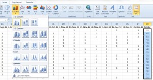
3) Click the ‘insert’ tab at the top
4) Choose ‘column’ and click on the first 2D column chart
5) Right mouse click on the chart and choose ‘select data’ from the menu that appears
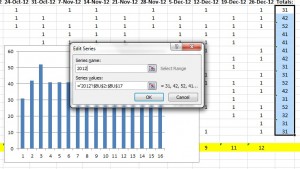
6) Under Legend Entries (Series) Select ‘Series 1′ and click ‘Edit’
7) In ‘Series Name’ type ’2012′ and click ‘ok’
8) In the box that appears now click ‘edit’ under the Horizontal (Category) Axis Labels
9) A data range box has appeared, select Column A Row 2 through Column A Row 17 and click ‘ok’, then click ‘ok’ again. (This is where you can choose to use student names if you want and you would instead choose Column B Row 2 through Column B Row 17)
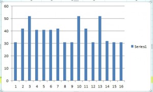
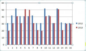
Now you have the basics of your column chart (n.b. you may need to scroll along the spreadsheet to see the graph displayed).
To add 2013′s data to the same line graph, follow a similar process:
1) Right mouse click on the chart and choose ‘select data’ from the menu that appears
2) Under Legend Entries (Series) Select ’2012′ and click ‘Add’
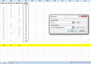
3) In ‘Series Name’ type ’2013′. In the ‘Series Values’ box, delete the symbols there. Go to the bottom of your spreadsheet and click on the 2013 tab, select the data from Column BT Row 2 through Column BT Row 17 and click ‘ok’
4) In the box that appears now click ‘edit’ under the Horizontal (Category) Axis Labels
5) A data range box has appeared; click the 2013 tab and select Column A Row 2 through Column A Row 17 and click ‘ok’, then ’ok’ again.
Now you have a column chart that shows the attendance for each individual youth side by side for 2012 and 2013.
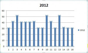
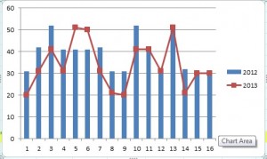
You can also easily view this same data as a line graph with markers
1) Right click on your column chart
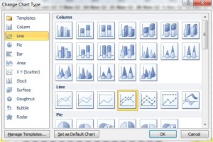
2) Select ‘Change Series Chart Type’
3) Select the fourth line graph shown ‘line graph with markers’ and click ‘ok’
This shows you the same data as the side by side comparison of the column chart, but it might also show the relationship between youth attendance in each year more clearly as well.
This concludes our series on how to use Excel, charts and graphs to track youth attendance.
Question: How useful has this series been for you? Please share your thoughts in the comments section below.
You can also connect with us by:
- Signing up to receive our posts via email
- Following us on Twitter
- Liking us on Facebook
- Signing up to our RSS feed
