• Home
  • About Us
    • Our Mission and Vision
    • The Youth Workin’ It Team
      • Shae Pepper, Managing Director
      • Stephen Pepper, Operations Director
    • Recommendations for the Youth Workin’ It Team
  • Youth Work Resources
    • How To Plan A Youth Retreat Book
    • 52 Scavenger Hunt Ideas
  • Contact Us

Youth Workin' It

Consultancy and Resources for Youth Workers and Organizations Worldwide

  • Youth Group Games
  • Session Plans
  • Fundraisers
  • Youth Retreats
  • Life Skills
  • Interview Skills
  • Scavenger Hunts
  • Would You Rather Questions
  • Program Administration
  • Policies & Procedures
  • Youth Participation
  • Group Agreement

4 Ways To Evaluate Youth Work Sessions

November 21, 2012 By Stephen Pepper 2 Comments

Youth work session evaluationAs you might have seen from our previous posts, we’re big fans of youth participation. One way that you can get your young people involved in your youth work programs is through getting feedback from them.

This week’s Best Of Youth Workin’ It therefore has 4 different methods you can use for session evaluations.

1. Number scale evaluations – This first post explores different ways that you can use a number scale to have young people evaluate your programs – and not just using a 1-10 scale!

2. Quantitative & qualitative evaluations – Number scales can be good if you want to measure your youth work in a quantitative way. However, young people’s opinions can often be more nuanced than that, meaning that you can miss a lot of important feedback if that’s the only method you use.

This post therefore gives ideas of ways you can have youth evaluate the sessions both quantitatively and qualitatively. It also has free sample evaluation templates that you can download and print off.

3. Post-It notes – They may be small, but post-its can be incredibly useful as a tool for getting feedback. This post gives 3 ideas for how to use post-it notes for session evaluations.

4. Tops and pants – This is a fun and unique way of getting your youth work sessions evaluated – probably the most engaging (for young people) of all the feedback methods suggested.

Question: What methods do you use to have youth complete session evaluations? We’d love to read your ideas in the comments below.

You can also connect with us by:

  1. Signing up to receive our posts via email
  2. Following us on Twitter
  3. Liking us on Facebook
  4. Signing up to our RSS feed


How Can I Stop Forgetting Important Tasks?

November 20, 2012 By Stephen Pepper Leave a Comment

Youth work reminders
Planning it old skool

Q: I keep finding myself forgetting to do important tasks and have missed the occasional meeting at work. What would you recommend for forgetful youth workers like me?!

A: Personally, I ‘d recommend using Google Calendar. It’s a great tool to keep track of your schedule, no matter where you are.

I find it to be far more useful and effective than using a paper-format weekly planner; here are 7 reasons why:

1. Unlimited Space

In a regular planner, you have a finite amount of space to enter tasks, meetings, etc. With Google Calendar, you can add as many entries as you need.

2. Time-based

You can add entries throughout each day and specify times for each task or meeting. This makes it far easier when scheduling everything you need to do, as you can see any available spaces in your schedule at a quick glance and ensure nothing overlaps.

3. Reminders

This is the feature that I find most useful. Google Calendar allows you to set up reminders by email or to pop-up for whenever you need them. These can be specified for x amount of minutes, hours, days or weeks before the event or task is due. If you have a smartphone, you’ll also get scheduled pop-ups on your phone if your Google account is connected.

You can set up as many reminders as you like, so for things like birthdays, I set a reminder for two weeks before and then another for two days before just in case.

4. Recurring Tasks & Meetings

With a regular weekly planner, you have to handwrite each entry, even if it’s the same entry each week. With Google Calendar, all you need to do is add an entry once and select “Repeat”. You can then specify when and for how often this task should be repeated.

For example, if your organization has a team meeting at 9:30 every Monday morning, just set this up once and select repeat. This will give you many options to tailor the recurrence, although in this particular scenario there shouldn’t be any change needed.

5. Intelligent Entry

If you add an entry that says “Meeting at work at 9:30am”, Google will automatically set the time of the meeting to 9:30am and the location as “Work” without you needing to adjust those fields.

(n.b. For further useful – but slightly creepy – intelligence by Google, try sending an email from your Gmail account that includes the phrase “I’ve attached”)

6. Invite Others

Google Calendar has an option to invite others to the meeting or task. If they have a Gmail account as well, this will automatically add it to their Calendar if they accept the meeting/task.

7. Accessible Anywhere

Google Calendar is available anywhere that you have an internet connection, meaning you don’t have to carry around a weekly planner. This makes it far easier to check your diary when you’re on the go and to add entries no matter where you are, particularly if you have a smartphone.

Question: What tools do you use as a youth worker to stop yourself from forgetting tasks or meetings? Let us know in the comments below.

You can also connect with us by:

  1. Signing up to receive our posts via email
  2. Following us on Twitter
  3. Liking us on Facebook
  4. Signing up to our RSS feed


How To Use Charts and Graphs To Track Individual Youth Attendance

August 29, 2012 By Shae Pepper Leave a Comment

Youth attendance graphs and charts
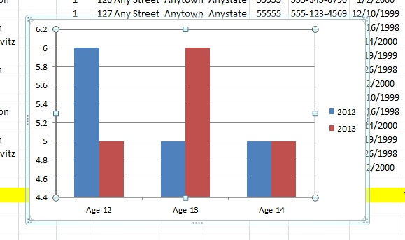
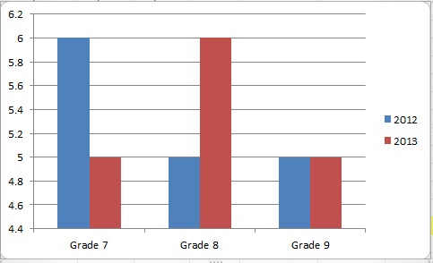
Over the past few weeks we’ve been showing you the many ways in which you can use Excel – and subsequently the charts and graphs feature in Excel – to track youth attendance.  It’s valuable for many reasons, but two main ones are for proving outcomes in monthly and annual reports and to provide quantitative data for potential or current funders and donors.

Our final charts and graphs today will show individual youth attendance. This is particularly useful if you have an ongoing program like a faith-based youth group or any other kind of youth club. You’ll be able to see what Johnny’s attendance was each year he was in your program, or if Jane’s attendance steadily increased or when Billy’s attendance dropped off after his parent’s divorce.

If your data will be used outside of your organization remember confidentiality and use codes to identify the youth in your program. In our example, we’ve just numbered the youth 1-16. However, if you’re using this purely for internal data you can also change the axis labels to show youth names.

Firstly, a column chart to clearly show side by side the attendance of your youth from year to year.

1)  Open the youth attendance spreadsheet

2) Select or highlight the data from Column BU Row 2 to Column BU Row 17

3) Click the ‘insert’ tab at the top

Youth attendance - 1


4) Choose ‘column’ and click on the first 2D column chart

Youth attendance - 2

5) Right mouse click on the chart and choose ‘select data’ from the menu that appears

6) Under Legend Entries (Series) Select ‘Series 1′ and click ‘Edit’

7) In ‘Series Name’ type ’2012′ and click ‘ok’

Youth attendance - 3

8) In the box that appears now click ‘edit’ under the Horizontal (Category) Axis Labels

9) A data range box has appeared, select Column A Row 2 through Column A Row 17 and click ‘ok’, then click ‘ok’ again. (This is where you can choose to use student names if you want and you would instead choose Column B Row 2 through Column B Row 17)

Now you have the basics of your column chart (n.b. you may need to scroll along the spreadsheet to see the graph displayed).

Youth attendance - 4

To add 2013′s data to the same line graph, follow a similar process:

1) Right mouse click on the chart and choose ‘select data’ from the menu that appears

2) Under Legend Entries (Series) Select ’2012′ and click ‘Add’

3) In ‘Series Name’ type ’2013′. In the ‘Series Values’ box, delete the symbols there. Go to the bottom of your spreadsheet and click on the 2013 tab, select the data from Column BT Row 2 through Column BT Row 17 and click ‘ok’

4) In the box that appears now click ‘edit’ under the Horizontal (Category) Axis Labels

5) A data range box has appeared; click the 2013 tab and select Column A Row 2 through Column A Row 17 and click ‘ok’, then ’ok’ again.

Youth attendance - 5

Now you have a column chart that shows the attendance for each individual youth side by side for 2012 and 2013.

Youth attendance - 6

You can also easily view this same data as a line graph with markers

1) Right click on your column chart

2) Select ‘Change Series Chart Type’

3) Select the fourth line graph shown ‘line graph with markers’ and click ‘ok’

Youth attendance - 7

This shows you the same data as the side by side comparison of the column chart, but it might also show the relationship between youth attendance in each year more clearly as well.

Youth attendance - 8

This concludes our series on how to use Excel, charts and graphs to track youth attendance.

Question: How useful has this series been for you? Please share your thoughts in the comments section below.

You can also connect with us by:

  1. Signing up to receive our posts via email
  2. Following us on Twitter
  3. Liking us on Facebook
  4. Signing up to our RSS feed


How To Create A Line Graph To Track Youth Attendance

August 22, 2012 By Shae Pepper Leave a Comment

Youth work line graphs
Because we know youth workers love line graphs this much

We’re currently working our way through a series that shows you how to use Excel to track your youth work attendance and how to use bar graphs, pie charts and line graphs to create visuals of that data. These charts and graphs can be very useful in monthly and annual reports and when showing data to prospective donors.

Today we’re going to share with you the steps to creating a line graph which will give a visual of the attendance data from both 2012 and 2013. You will be able to see the two years compared to one another and it will show trends in the data over the course of the year. In the detailed steps below, we’re using our example attendance spreadsheet. Remember the spreadsheet is simply an example – your data will not have such repetitive patterns in it.

1) Open the youth attendance spreadsheet

2) Select or highlight the data from Column U Row 19 to Column BT Row 19

3) Click the ‘insert’ tab at the top

4) Choose ‘line’ and click on the first 2D line graph

Youth attendance 1

5) Right mouse click on the chart and choose ‘select data’ from the menu that appears

6) Under Legend Entries (Series) Select ‘Series 1’ and click ‘Edit’

Youth attendance 2

7) In ‘Series Name’ type ‘2012’ and click ‘ok’

8) In the box that appears now click ‘edit’ under the Horizontal (Category) Axis Labels

9) A data range box has appeared, select Column U Row 1 through Column BT Row 1 and click ‘ok’, then click ‘ok’ again.

Youth attendance 3

Now you have the basics of your line graph (n.b. you may need to scroll along the spreadsheet to see the graph displayed).

To add 2013’s data to the same line graph, follow a similar process:

1) Right mouse click on the chart and choose ‘select data’ from the menu that appears

2) Under Legend Entries (Series) Select ‘2012’ and click ‘Add’

3) In ‘Series Name’ type ‘2013’. In the ‘Series Values’ box, delete the symbols there. Go to the bottom of your spreadsheet and click on the 2013 tab, select the data from Column U Row 19 through Column BS Row 19 and click ‘ok’

Youth attendance 4

4) In the box that appears now click ‘edit’ under the Horizontal (Category) Axis Labels

5) A data range box has appeared; click the 2013 tab and select Column U Row 1 through Column BS Row 1 and click ‘ok’, then ‘ok’ again.

Now you have a line graph that shows the relationship between your attendance in 2012 and 2013.

Youth attendance 5

You might see a trend in youth attendance that peaks or drops at different times of the year. By tracking the data year after year and putting it in this visual format, you’ll be able to see more easily the attendance at your youth work programs.

Question: Are there any aspects of Excel you’d like to know more about to help with your youth work administration? Let us know in the comments below and we’ll try and cover this in the future.

You can also connect with us by:

  1. Signing up to receive our posts via email
  2. Following us on Twitter
  3. Liking us on Facebook
  4. Signing up to our RSS feed


How To Use A Pie Chart For Youth Attendance

August 15, 2012 By Shae Pepper Leave a Comment

Pie chart youth work
Now this is a ‘pi’ joke….

We’re currently working our way through a series about how to use Excel to track youth attendance and to create charts and graphs using that data.

You may be asking yourself, ‘why are they showing me the same information over and over just in different formats?’ Despite Stephen‘s ‘pie’ joke, we’ve actually only shown you how to create a bar graph with your data so far. There are many types of graphs and charts, but the three we’re going to use are the bar graph, the pie chart and the line graph.

  1. Bar Graph – The bar graph is the type of graph you want to use to make a side by side comparison; in our examples, we’ve been showing the change in ages and grades over a two-year period.
  2. Pie Chart – The pie chart is the type of chart you want to use to show the percentage for each part of a ‘whole’; in the end you want your pie to equal 100%.
  3. Line Graph – The line graph is the type of graph you want to use when you need to show a trend over a period of time; we’ll be looking at line graphs in the coming weeks.

Today we’re going to show you how to use the bar chart you already created to create a pie chart. The data will be the same, but you’ll be highlighting the parts of the whole rather than a side-by-side comparison as before.

1) First make sure you’ve created your spreadsheet, or at the very least have our example open.

2) Follow the steps to create a bar graph of youth ages or grades.

3) Create a copy of your bar chart by copying and pasting it below your original bar chart.

4) In Excel 2010, go to the ‘Chart Tools’ contextual tab (in our example it’s highlighted in green), choose ‘Design’ and then in the far left of the ribbon (toolbar) select ‘Change Chart Type.’

5) From the list in the left of the box that appears, choose ‘Pie’ and select the first pie chart icon.

6) At this point your bar chart will become a pie chart.

7) Highlight your pie chart by clicking on the pie, then right mouse click and select ‘Add Data Labels’. This will cause the numbers of your data to appear but you want to show percentages.

8) Right mouse click over your pie chart again and this time select ‘Format Data Labels.’

9) Uncheck ‘Value’ and click to check ‘Percentage’ and ‘Close.’

You now have a pie chart showing the percentage breakdown for your programs for one year. You can move this on the spreadsheet by dragging it or you can copy and paste it into another document, such as a report in Word or a Powerpoint presentation.

Remember to check back over the next few weeks for the rest of our series where we’ll be creating line graphs to track changes in your youth program attendance over time.

Question: Do you think that using charts and graphs to show your attendance data is useful when writing monthly or annual reports?  Why or why not?  Share your thoughts in the comments below.

You can also connect with us by:

  1. Signing up to receive our posts via email
  2. Following us on Twitter
  3. Liking us on Facebook
  4. Signing up to our RSS feed


« Previous Page
Next Page »

501 Would You Rather Questions

501 Would You Rather Questions

52 Scavenger Hunt Ideas

52 Scavenger Hunt Ideas cover

How To Plan A Youth Retreat

How To Plan A Youth Retreat cover

Categories

Best Of Youth Workin' It
Book Reviews
Guest Post
Spotlight on Youth
Types Of Youth Work
Would You Rather Questions
Youth & Society
Youth Group Activities
Youth Group Fundraiser
Youth Group Games
Youth Retreat
Youth Work Program Administration
Youth Work Q & A
Youth Work Session Plan Ideas
Youth Worker Stuff
Youth Workin' It Stuff

Tags

Administration Balloons Boundaries Budget Christmas Communication Facebook Food Food Games Global Issues Global Youth Work Goal Setting Group Development Group Games Guest Posts Interview Skills Life Skills Parents Planning Policies and Procedures Relationships Relay Games For Teenagers Scavenger Hunt Ideas School Self-Esteem SMART Social Media Strategic Planning Team Building Twitter Up Front Games Volunteering Volunteers Water Games For Youth Would You Rather Youth Behavior Youth Cartel Youth Group Bonding Youth Participation Youth Retreat Center Youth Retreat Themes Youth Scavenger Hunt Youth Work Definition Youth Work Resources Youth Work Training

Search Youth Workin’ It

All Content © Copyright 2011-2025, Stephen & Shae Pepper, youthworkinit.com